I redesigned my blog...again...
21 Aug 2017I decided to do yet another overhaul of my blog. This time around, I had a look at everything and asked myself “Does this greatly enhance the user experience?” If the answer was anything other than “Absolutely”, I trashed it. Needless to say, most everything got trashed.
- The Material Floating Button
- The stupid footer
- The search in the menu
- General tom-foolery going on in the menu
- The stupid background image
- Disqus
One thing I plan on adding to the menu is a “Categories” feature, just so
viewers I can more easily find things without going through the whole list
of posts.
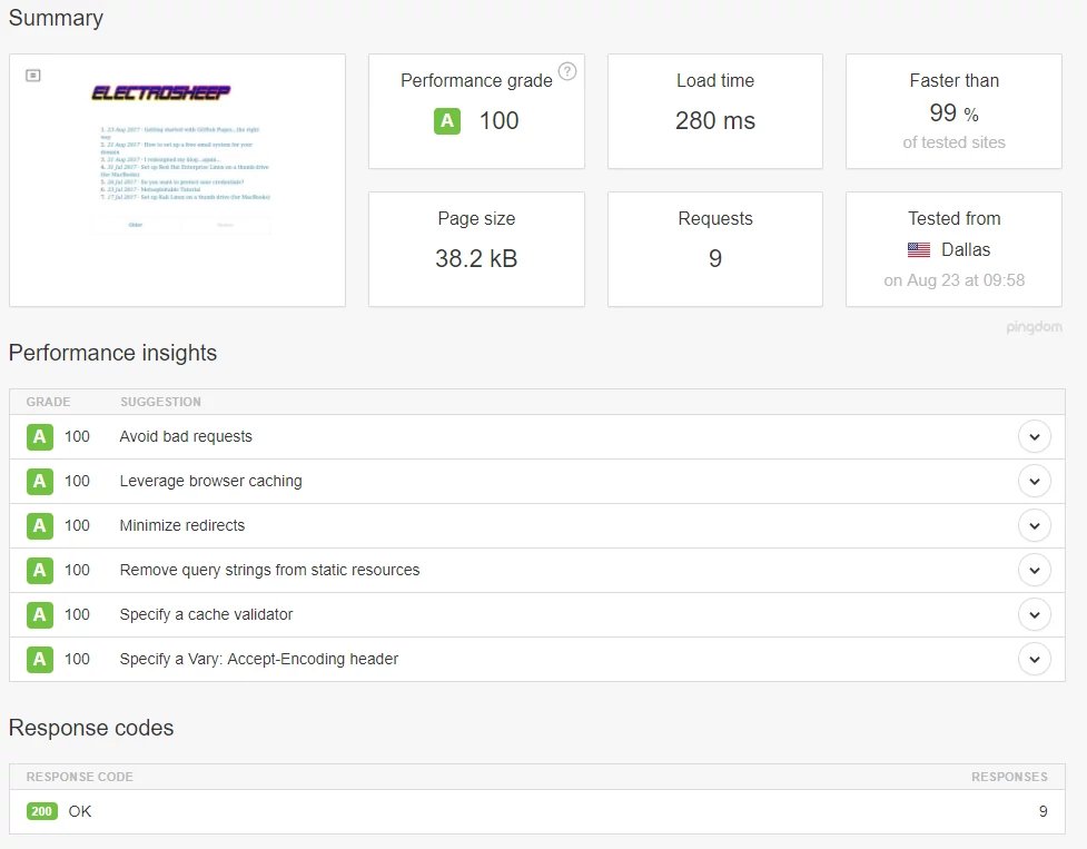
Now, what is the end-game for me here? Well my friend, I proudly present to you

And also

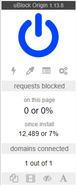
Now, the real question is why did I get rid of Disqus? Well, Disqus was causing JavaScript errors, and also was triggering uBlock. Also, I have no delusions of grandeur, and no one besides myself had ever used it. Also, my email is listed in the about section. So, if anyone really needs to contact me, they can use that channel. Until Disqus stops triggering uBlock, and giving me JavaScript errors, I wouldn’t count on seeing it again.
I am still working on Google’s PageSpeed Insights for my page, but it seems like the main issue there is render-blocking CSS in above-the-fold content. My site would not look good without the CSS. For one, the menu button is a checkbox without styling, which doesn’t make any sense at all. Because my site loads quite fast, and because I think no CSS would ruin it, I don’t think I’ll follow Google’s suggestion.
I have to admit, I am massively pleased with the results!
25/08/2017 Update
I have just completed reformatting most of my blog posts. I have to say, after having reviewed them, I’m not sure if I should be totally embarrassed about what a complete idiot I was/am, or if I should be proud about how far I’ve come since I started writing these stupid things lmao.

